Tonight, I sat down to do some journalling with a glass of bourbon and a lit candle, something I haven’t done in quite a long time. Too long, in fact.
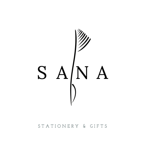
While writing out some thoughts, I remembered that I was working on a logo for SANA Stationery & Gifts. So, I put my pen down (not one that I made; a LAMY Studio) and turned on my computer. I looked through the logos I had put together. One — the one I picked — caught my eye.
I got to thinking about what it is about the logo that I like. The image is a nod to Letters’ Lounge. It’s clean. It’s almost vacant, which I like; a page written on is still mostly empty. I like that the lines of the “feathers” are not identical, same as peoples’ handwriting — you can still distinguish the letters and words to make meaning from the lines drawn. The bottom tip of the image is meant to resemble the nib of a fountain pen. The image also pierces the letters, like a sword in stone.
I’d like to say that this was all premeditated. My unconscious may have been in the passenger’s seat when I was making the drafts. Even still, it’s imbued with symbolism.
I’m so proud of it that I printed off a picture-sticker and put it on my iPad case, something I’m not usually inclined to do. I avoid labels and memorabilia. I don’t like being attached to a branded identity. SANA Stationery & Gifts is different, though, because it’s mine and I want to make something of it.

Leave a Reply